
Quality control charts have been used in manufacturing settings since 1924. Invented by Walter Shewhart, this tool is an effective way to monitor the output of a manufacturing process and identify potential issues before they become catastrophic. This tool is not constrained to manufacturing systems, however. Due to their customization, quality control charts can also be effective tools for identifying anomalies.
Quality Control Chart Types
While quality control charts are often referenced as a whole, there are several different types of quality control charts. These charts can be divided into two main groups, depending on the data they use: attribute data or numerical data. Attribute data is any data type that considers a feature or count of data. For example, the number of defective units is a type of attribute data. Numerical data, on the other hand, is continuous data. Dimensions, temperature, and weight are all types of numerical data.
When working with attribute data, the three main types of control charts are P charts, U charts, and C charts. P charts show a proportion of nonconforming items within a group. U charts illustrate the average amount of defects per group. Lastly, C charts count the number of defects per group. Since P charts are based on a proportion of defects, they should be used whenever group sizes vary. When group size is constant, C charts are the logical choice.
When working with numerical data, X bar charts, R bar charts, and S bar charts can be used. The X bar chart tracks the mean of samples that are in a group of constant size. In other words, if ten items are taken for the first sample, ten items should be taken for all subsequent samples. R bar charts monitor the variation of samples with a group of constant size. Like R bar charts, S bar charts measure variability within the samples. However, S bar charts utilize standard deviation to calculate this variability. Often, S bar charts are used for groups of smaller size, whereas R bar charts are used for larger group sizes.
Identifying defects and anomalies
Regardless of the quality control chart used, there are three essential lines on any quality control chart. These lines are the center line (usually the average), upper control limit, and lower control limit. These upper and lower control limits indicate whenever a manufacturing process is out of control, or there is an anomaly.
Upper and lower control limits are usually calculated by the standard deviation. Upper control limits are typically three standard deviations above the mean, and lower control limits are three standard deviations below the mean. This calculation is not arbitrary. It is based on extensive testing from Dr. Shewhart and a theorem from Chebyshev. This theorem states that 89% of data will fall within six standard deviations from the mean regardless of the data distribution.
Whenever data falls outside these control limits, there is an issue or anomaly that needs to be addressed. But this is not the only way control charts can be used. There are several other instances where control charts can indicate out-of-control data and anomalies:
· Two out of three points are on the same side of the center line and greater than two standard deviations from the center line.
· Four out of five points are on the same side of the center line and greater than one standard deviation from the center line.
· Eight consecutive points are on the same side of the center line. This also applies if any ten out of eleven, twelve out of fourteen, or sixteen out of twenty points are on the same side of the center line.
· Any other observable trends or patterns on the chart.
When using quality control charts, it’s crucial to keep these indicators in mind to recognize process issues or anomalies as quickly as possible.
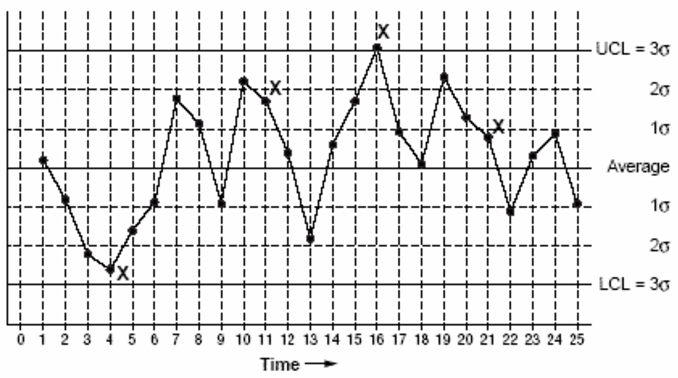
Example Quality Control Chart
Now that we have reviewed the indicators of quality control charts, we can use these indicators to review an example quality control chart. In the following chart, notice the following out-of-control data:
· Point 4: second point that is two standard deviations from the center.
· Point 11: fourth of five consecutive points that is one standard deviation from the center.
· Point 16: three standard deviations from the center.
· Point 21: eighth point in a row above the center.
Control Chart Applications to Anomaly Detection
While quality control charts have been a prominent tool in manufacturing for nearly the past 100 years, they are gaining popularity in other applications. For example, quality control charts have been used in conjunction with machine learning to identify anomalies in energy usage. They have also been used to monitor water consumption to identify anomalies in the form of broken toilets. Control charts have also been used to detect anomalies in individual home appliances. Due to the variety of quality control chart options, customization, and ease of use, these charts are an excellent tool for detecting anomalies in data of any kind.
Comments